Hello, I have an image from my course notebook and I’m curious about its implementation. The output was displayed without the corresponding code for the iris dataset. Can someone share the solution?
Hello, I have an image from my course notebook and I’m curious about its implementation. The output was displayed without the corresponding code for the iris dataset. Can someone share the solution?
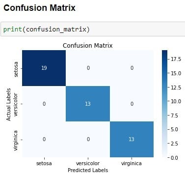
For this purpose, the seaborn library proves valuable. It facilitates the visualization of a confusion matrix as a heatmap with annotations for each cell. The heatmap offers a clear and visual representation of the confusion matrix, aiding in the identification of patterns and trends in the data.
This method stands out as one of the simplest approaches for plotting a confusion matrix.