Plotting with Matplotlib
Matplotlib is a Python library for creating 2D plots and visualizations. It can generate high-quality figures that can be used in various formats and environments. To use Matplotlib in your notebook environment, you need to set it up so that the plots are displayed inline as images. This is the first step in working with Matplotlib and creating plots in your notebook.
import pandas as pd               # Python Data Analysis Library
import matplotlib.pyplot as plt   # Visualization Library
import numpy as np                # A general-purpose array-processing package
%matplotlib inline
The code above will import the required libraries and there will be no output to it.
Generate data:
Now we generate some data to use while experimenting with plotting:
Matplotlib has two main objects that are used to create plots:
- Figure: A Figure object holds one or more Axes objects and is used to save the plots to files in different formats (e.g. PNG, SVG).
- Axes: An Axes object represents an individual plot with an x-axis, a y-axis, labels, and various methods for creating plots.
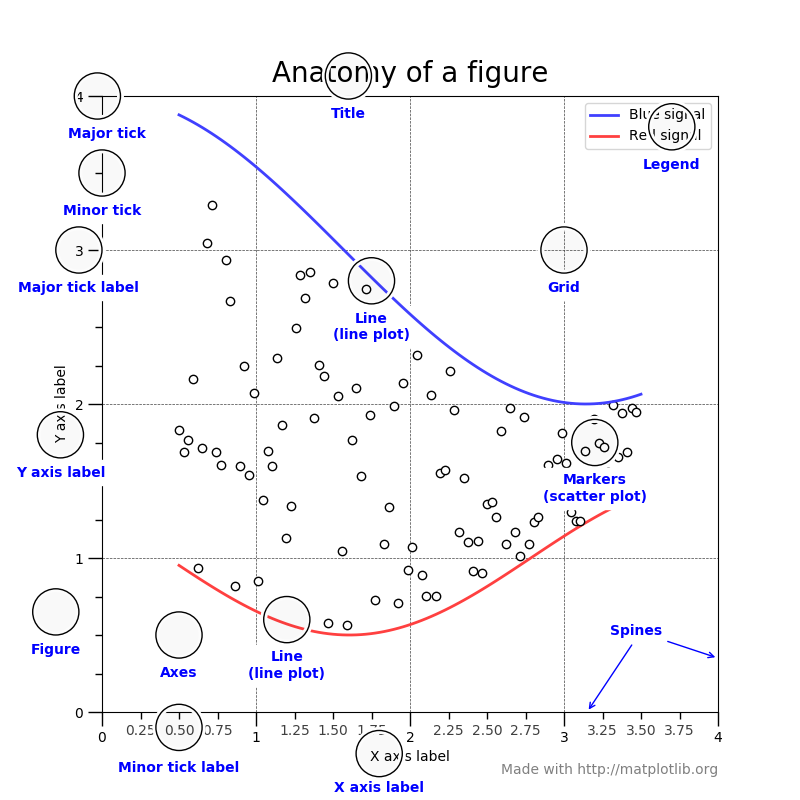
Anatomy of a figure:
Line plot:
- To create a plot using Matplotlib, specify the size of the
Figureobject in inches and create anAxesobject on it. - Then, you can use the
plotmethod of theAxesobject to plot the data, providing the data for the x-axis (independent values) and y-axis (dependent values) as arguments. - In this case, the
timesandtempsdata are plotted on the x-axis and y-axis, respectively.
Axes labels for the plot:
From there, we can do things like ask the axis to add labels for x and y, here is an example code of how you can do this:
Title for the plot:
We can also add a title to the plot:
Of course, we can do so much more!
Plotting multiple lines with different line styles:
- When creating plots using Matplotlib, you can customize the plot’s appearance by modifying style attributes such as
linestyleandcolor. - The
colorattribute can take various values, including named colors likeredorblue, as well as HTML color codes. - In the code below, the
tab:redvalue is being used to specify a shade of red from the Tableau color set in Matplotlib. This allows you to customize the appearance of your plots to meet your specific needs and preferences.
Scatter plot:
- If you want to plot your data as a scatter plot rather than a line plot, you can modify the
linestyleattribute tononeand specify a marker type, size, and color. - Alternatively, you can use the
scattermethod, which is slower but allows you more control over the appearance of the plot, such as the ability to color the points individually based on a third variable. - This can be useful if you want to visualize the relationships between different variables in your data.